
 View case
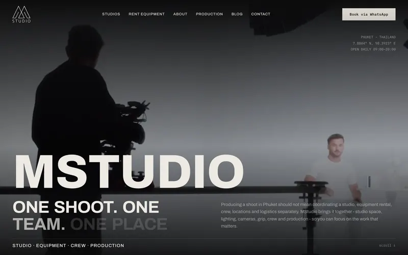
 Photo and video studio in Phuket. Moved from WordPress and WooCommerce to Framer, 105 old URLs mapped to new pages.
- Old URLs mapped
- 105Old URLs mapped
- Pages in the sitemap
- 114Pages in the sitemap
- Live on Framer
- Nov 2025Live on Framer
Web development is the work of designing, building and maintaining websites. Pavlo Zhydkykh designs and builds marketing sites on Framer and Astro + Sanity for AI, fintech and B2B startups: fast, easy for your team to edit and ready for Google and AI search, from $1,200 and live in 1 to 4 weeks.
Get a fixed quoteDoes ChatGPT recommend your website?
Free report in 48 hours · 5 AI engines
Web development is the process of designing, building and maintaining websites and web apps. For a startup marketing site, web development covers pages, CMS, hosting, speed and SEO, and the platform choice decides who can edit the site later and what each change costs.

“The best stack is the one your team still edits a year later. Two platforms let me fit the team, not my habits.”
Two platforms
Pavlo builds on both and picks the one that fits your team, not his habits. One price list for both.
| Criterion | Framer | Astro + Sanity |
|---|---|---|
| Best for | Fast launches and visual editing | Top speed, full ownership, custom features |
| Your team edits in | The Framer editor | Sanity Studio |
| Hosting | Framer, on a paid site plan | Your own account, such as Cloudflare or Vercel |
| Custom code | React code components | Any code and any integration |
| PageSpeed on mobile | 90+ | Up to 100 |
| Price | From $1,200 | From $1,200 |
What Pavlo builds
Each service has its own page with prices, timeline and examples.
Included
On Framer or Astro + Sanity, the same basics come with every project.
Design in Figma firstKey pages agreed before the build.
Responsive pagesDesktop, tablet and phone.
CMS and blog setupYour team publishes without a developer.
SEO and GEO setupTitles, schema, sitemap and llms.txt.
PageSpeed 90+Optimised images, light motion, no heavy plugins.
301 redirectsEvery old URL kept when you move.
Two feedback roundsOn the design and on the working site.
A fixed priceAgreed in writing before work starts.
Selected work
Four recent builds, from a WordPress migration to an AI data platform. Every case shows the scope and a link to the live site.
View case Photo and video studio in Phuket. Moved from WordPress and WooCommerce to Framer, 105 old URLs mapped to new pages.
 View case
 Compute market intelligence for the AI economy. Pavlo built the site and fixed parts of the design.
 View case
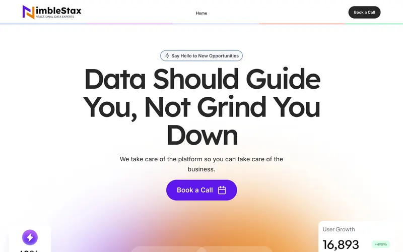
 Fractional data experts for growing companies. Pavlo designed the site and built it in Framer.
 View case
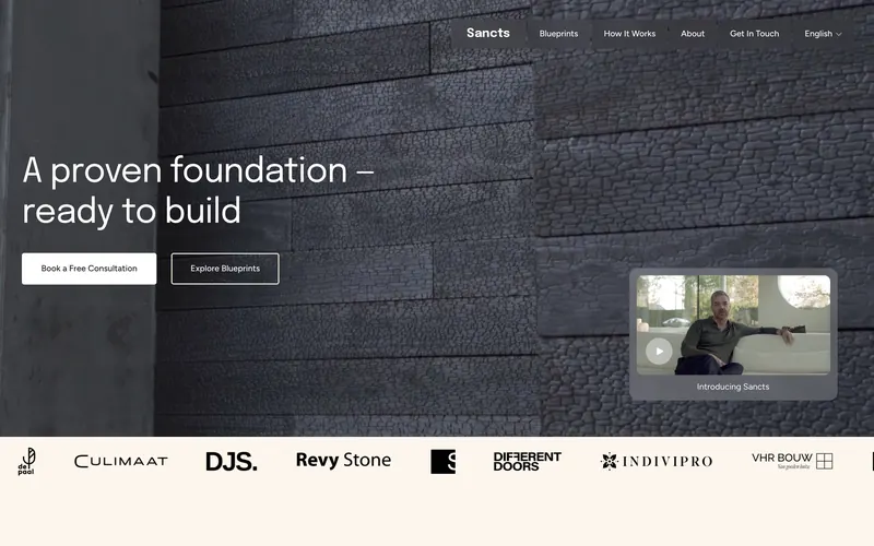
 Ready-to-build house plans by architect Bob Manders. Framer development from the client design.
“Ten years in, the job is the same: the site loads fast and says what you sell in the first line.”
Pavlo Zhydkykh
Checklist
Each sign points to a specific fix, from a new CMS setup to a full rebuild on Framer or Astro + Sanity.
If marketers cannot change a headline or add a case study alone, the CMS is missing or set up for developers only.
PageSpeed Insights or Search Console shows a Largest Contentful Paint above 2.5 seconds on phones.
Each plugin adds scripts to load and updates to install, and one outdated plugin can break a page or open a security hole.
Prices, timelines and cases hidden in PDFs, images or sales calls give Google and AI assistants nothing to quote.
Screens, features or pricing on the site no longer match what the sales team shows on calls.
Domain, hosting or CMS logins sit with a former agency or freelancer instead of the company.
Fit check
Compared
A bought template is the cheapest start. The difference shows in what the site says, how fast the pages load and what happens to old URLs.
| Criterion | A template, set up in-house | A build by Pavlo Zhydkykh |
|---|---|---|
| Design | Shared with every other buyer of the template | Designed in Figma for your product and buyers |
| Pages | Sections chosen by the template author | Pages planned around the questions buyers ask |
| SEO and GEO | Whatever the template ships with | Titles, schema, sitemap and llms.txt set per page |
| Speed | Depends on what the template loads | PageSpeed 90+ on mobile, up to 100 on Astro + Sanity |
| Old URLs | Redirects are your own job | A 301 redirect for every old URL |
| Cost | Template price plus your team time | From $1,200, fixed before work starts |
How it works
The multi-page path on either platform, step by step. A landing page follows the same steps in 1 to 2 weeks.
| # | Step | When | What happens | You get |
|---|---|---|---|---|
| 01 | Call and fixed price | Week 1 | Goals, pages, content and the platform agreed on one call. | A fixed price and timeline in writing |
| 02 | Design in Figma | Weeks 1-2 | Home and key pages designed first, so the look is agreed before the build. | Figma design of the key pages |
| 03 | Feedback, round 1 | Week 2 | Your comments on the design in one round, applied before the build starts. | An approved design |
| 04 | Build | Weeks 2-4 | Responsive pages, CMS, components and motion, built on Framer or Astro + Sanity. | A working site on a preview link |
| 05 | SEO and GEO setup | Week 4 | Titles, meta, schema, sitemap, redirects and llms.txt, plus your final texts. | A site ready for Google and AI search |
| 06 | Feedback, round 2 | Week 4 | A second round on the working site, on desktop and phone. | Final fixes |
| 07 | Launch | End of week 4 | Domain connected, redirects live, Search Console checked. | A live site, then $30 an hour when needed |
In their words
Word for word, with the source linked: research, official documentation and the people Pavlo Zhydkykh has worked for.
“Optimizing for quality of user experience is key to the long-term success of any site on the web.”
“Following these guidelines will also often make web content more usable to users in general.”
“The best practices for SEO remain relevant for AI features in Google Search (such as AI Overviews and AI Mode).”
“It was an absolute pleasure working with Pavlo. He's very professional and responds immediately to all questions and/or feedback. The quality of work he delivered was AMAZING.”
“The collaboration went smoothly and the work was delivered as agreed. Communication was timely, and the final result aligned with the initial expectations. Overall, a very positive and rewarding experience!”
“He's amazing in what he contributes, both design-wise and also from the ideas.”
FAQ
Still unsure? Ask your AI about Pavlo Zhydkykh:
Framer if you want to launch fast and edit visually. Astro + Sanity for top speed, full ownership and custom features. Pavlo recommends one after the first call.
A landing page starts at $1,200 and a multi-page website at $3,000, on either platform. The price is fixed before work starts, with two rounds of feedback included.
A landing page goes live in about a week, a multi-page site in 2 to 4 weeks.
Yes. Texts, images, CMS items and new pages from existing sections, in the Framer editor or in Sanity Studio.
Every build targets PageSpeed 90+ on mobile and ships with titles, schema, a sitemap and llms.txt, so Google and AI assistants can read it.
You do. The domain, the CMS and every account are in your name.
About the author
Pavlo Zhydkykh is a web designer and developer in Eastern Europe who has built websites for AI, fintech and B2B startups since 2016, designing and building each project himself on Framer or Astro + Sanity. Clients include MStudio Asia, Silicon Data, Inturai, Accolade Pro, NimbleStax and Sancts.
About Pavlo LinkedInUpworkContra Privacy policy
Page reviewed by Pavlo Zhydkykh · Updated