
What makes a gym free trial class page actually convert? Structure, forms, proof and follow-up that turn nervous visitors into booked classes.
Written by
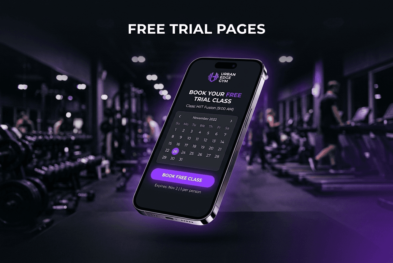
Your free trial class page is the single highest-leverage page on your gym's website - every ad, every social post and every “just looking” visitor ends up there. Yet most gyms treat it as an afterthought: a generic contact form and a “get started” button. After building sites for MMA, boxing and fitness gyms, I can tell you exactly what separates trial pages that fill classes from ones that quietly leak members. Here is the full breakdown.
Key takeaways
A free trial class page has one job: turn interest into a booked, scheduled visit - not “capture a lead” for someone to chase later.
People book a specific class at a specific time, so the schedule belongs on the page, not behind another click.
The biggest conversion killer is fear, not friction: show beginners, coaches’ faces and exactly what the first visit looks like.
Every extra form field costs you bookings - name, contact and chosen class is all a trial booking needs.
What happens after the click (confirmation, reminder, “what to bring”) decides whether the booking becomes a show-up.
Why the free trial class page decides your month
Almost every route a prospective member takes ends at the same place. They see your ad, your reel or a friend’s story, they look you up, and within two taps they are either on a free trial class page that makes booking feel easy - or on a homepage that makes them work for it. On the gym sites I build, the trial page consistently takes more traffic than every other page except the homepage, and it is the only one where a visit directly becomes revenue.
That is why I treat it as a landing page, not an information page. Everything on it either moves someone towards booking a class or gives them a reason they will be fine when they show up. Anything else - the full membership grid, the equipment tour, the supplement shop - belongs elsewhere on the site. I covered how the wider site supports this in MMA gym website design that converts walk-ins into members; the trial page is where all of that pressure finally lands.
People do not book “a gym”. They book a specific class, at a specific time, with a clear picture of what happens when they walk in.
What makes people actually book
The pattern across every gym build I have shipped: the pages that convert are the ones that answer a nervous beginner’s questions before the form. That means:
A specific offer. “Book a free trial class” beats “get started”. Name the class types they can pick - beginners’ boxing, fundamentals BJJ, open gym induction.
The schedule on the page. If picking a time takes another click or a phone call, you lose the shy majority. Show real days and times next to the form.
Coaches with faces and first names. Booking feels safer when you know who will meet you at the door.
A “your first visit” section. What to wear, what to bring, when to arrive, what the first ten minutes look like. This defuses the fear that stops beginners.
Proof from people like them. One testimonial from someone who started as a total beginner is worth five from competition athletes. Most martial arts sites get this exactly backwards - I wrote about those intimidation traps in why martial arts gym websites lose members at the first click.
A tappable phone number. Some people will always rather call. Let them.
Notice that price reassurance matters too: “free, no card, no contract” in plain text near the button removes the suspicion that “free” hides a sales pitch.
The structure I build, top to bottom
When I build a trial page for a gym client, the section order is always a variant of this:
Hero: one line naming the offer and the person it is for (“Your first boxing class is free”), one booking button, one real photo of your actual gym - not stock.
Class picker + schedule: the classes a beginner can join, with days and times, feeding straight into the form.
Your first visit: the what-to-expect section that kills fear.
Coaches: faces, first names, one line each.
Beginner proof: two or three short testimonials from members who started from zero.
The form: short, with the chosen class carried in.
FAQ: the five questions every front desk answers daily.
You can see this exact logic wired into The Forge, my Framer template for MMA and boxing gyms - the trial-class flow, schedule and coach sections are pre-built, so a gym can have a working version of this page live in a weekend and adapt the copy to its own classes.
For more worked examples of these patterns on real sites, I reviewed seven of them in 7 boxing gym websites that actually sell memberships.
The form: every field costs you bookings
The trial form needs three things: a name, one way to reach them, and the class they picked. That is it. Address, fitness goals, “how did you hear about us”, date of birth - every one of those fields is a place where a hesitant beginner closes the tab. Ask those questions in person, when they are standing in your gym and have already said yes once.
Two details I add on every build: the button text repeats the offer (“Book my free class”, never “Submit”), and the button is followed by one quiet reassurance line - “No card. No contract. Just turn up.” If you want a broader tour of conversion mechanics like these, Wes McDowell’s video on landing page improvements is a solid, practical watch: (9 Landing Page Hacks To Get More Leads, Wes McDowell).
After the click: turning bookings into show-ups
A booking is not a member; it is a promise made in a brave moment. The gap between booking and showing up is where gyms quietly lose most of their trial pipeline, and the fix lives on your website too.
The confirmation page should repeat the class, day and time, tell them exactly where to park or enter, and restate the what-to-bring list. The confirmation email or text should arrive instantly, and a reminder the day before - written like a human, ideally from the coach they will meet - measurably improves show-up rates on the gyms I have worked with. None of this needs custom software; a form tool and an automation cover it.
One thing your trial page does not need: heavy scroll animation. A little motion helps a dark, energetic gym brand feel alive, but it is polish, not conversion - and it has a real price tag, which I broke down in what scroll-driven animation actually costs to build. Spend that budget on photography of your actual gym first.
What this costs to get built
The honest answer: a trial page done properly is a structure and copy problem, not a big-budget problem. It is usually built as part of a wider site project - I broke down the full numbers in how much a gym website costs - but as a standalone landing page on a template base, it is one of the cheapest high-ROI things a gym can commission. One retained member typically covers it several times over.
Want a trial page that fills classes?
Pavlo Zhydkykh builds conversion-first websites for gyms and fitness businesses on Framer - trial-class pages, schedules and booking flows included. If your current page is a contact form and a prayer, get in touch and he will tell you honestly what to fix first.
Related reading
What should a free trial class page include?
A specific offer naming the class, the real schedule, a short booking form, coach photos, a what-to-expect section for first-timers, and proof from members who started as beginners. Its only job is to get a class booked — membership details and pricing tiers belong on other pages.
Should a gym trial be free or paid?
Both work; they filter differently. Free trials maximise volume and suit gyms with strong coaching cultures that convert in person. A small paid trial ($10–$20) attracts fewer but more committed people and nearly eliminates no-shows. Whichever you choose, say clearly there is no card and no contract commitment attached.
How many fields should the booking form have?
Three: name, phone or email, and the class they want to join. Every additional field measurably reduces completed bookings. Collect goals, experience and background in person during the visit — that conversation is also your best sales tool.
Do I need a separate landing page, or can people book from my homepage?
You need both paths, but ads and social links should always point at the dedicated trial page. A homepage has many jobs; a landing page has one, and pages with one job convert far better. It also lets you match the page headline to whatever the ad promised.
How do I reduce no-shows for free trial classes?
Confirm instantly with the class, time, location and what to bring; send a human-sounding reminder the day before, ideally naming the coach; and make the first visit feel expected (“Ask for Sasha at the desk”). People show up for people, not for bookings.


